Earthworks Efthimiou
Projects | | Links: Live preview
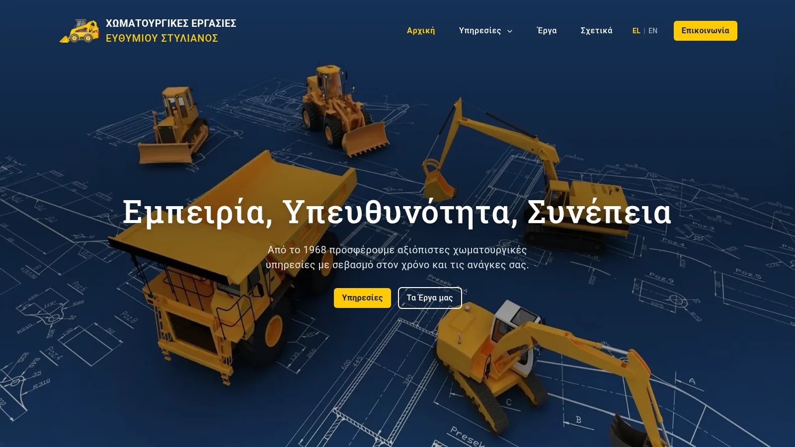
Business website for a Greek family earthworks company: fully static (Astro 5 + Tailwind CSS 4), designed around a filterable photo gallery of completed works, six service pages, and a mobile-first layout for customers who mostly arrive on their phones.
Status: pre-launch. The build is complete and running on a live preview, linked above. The site launches once real project photography and final business details replace the placeholder material standing in for them: the photographs across the site are currently stock stand-ins.
At a glance
| For | Family earthworks business, three generations, working in Attica since 1968 |
| Stack | Astro 5 + Tailwind CSS 4, fully static: no CMS, no database |
| Centerpiece | A works gallery with per-service filtering, linked from six service pages |
| Audience | Greek-speaking, mostly on mobile |
The brief
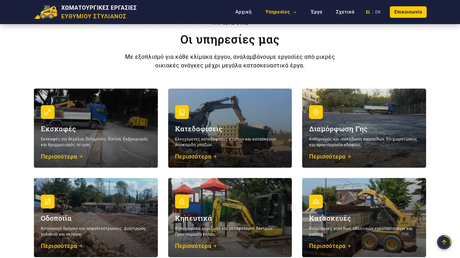
The company has been doing earthworks in Attica since 1968: excavation, demolition, land grading, road works, landscaping, and constructions such as sports courts and parking areas. Its previous website was due for replacement, and the new one has a clear job: present the services and the finished work, clearly and fast, to customers who mostly reach it from a phone.
The build
A fully static Astro 5 and Tailwind CSS 4 site on Cloudflare Pages: every push deploys automatically, hosting is effectively free, and with no database and no server-side code there is nothing to patch. The build started from an open (MIT) Astro theme, kept as solid scaffolding and reworked page by page into the company’s own design.
- A visual identity from the trade: construction-machinery yellow on deep blue, applied with strict contrast rules (the yellow only ever sits on dark backgrounds) and alternating section tones that keep long pages readable.
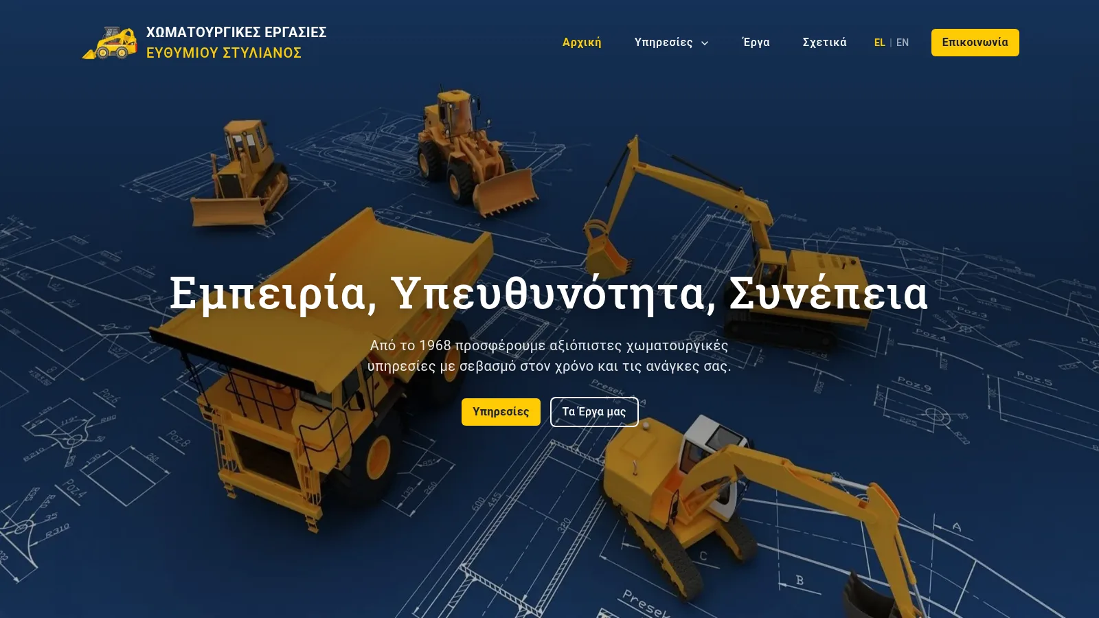
- An opening sequence on the homepage: the title types out the company’s three words, “Εμπειρία, Υπευθυνότητα, Συνέπεια” (experience, responsibility, consistency), letter by letter before the subtitle and buttons fade in; further down, the company’s key numbers count up as they enter the view.
- Mobile-first in the details: a tap-to-call button in the header on phones, kept clear of the company name at any width, and hero typography sized so the longest Greek word in the title fits narrow and zoomed screens without clipping.
- Practical touches: email addresses protected from scrapers, a back-to-top button with a circular scroll-progress indicator.
The works gallery
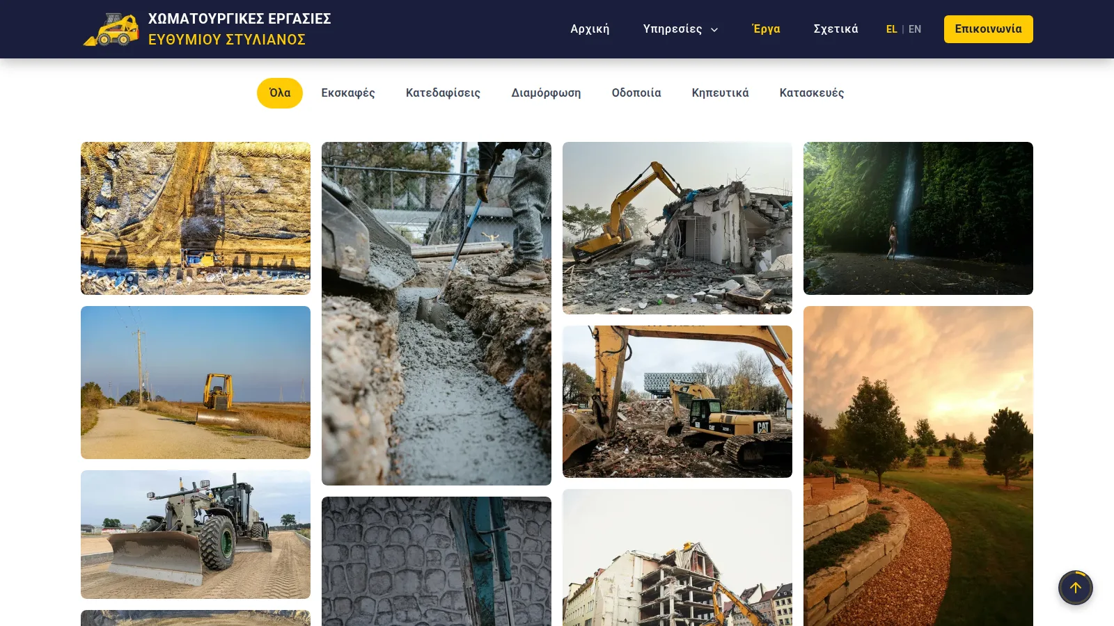
For a business that sells physical results, photographs are the most convincing content, and the gallery is the centerpiece of the site:
- A masonry photo wall, one to four columns depending on the screen.
- Category filters matching the six services. The active filter can also be set from the URL, so every service page links straight to its own set of photos.
- Full-screen viewing in a PhotoSwipe lightbox.
- Every photo is prepared in two webp sizes, a light thumbnail for the wall and a larger version for the lightbox, so the page stays fast despite the volume of images.
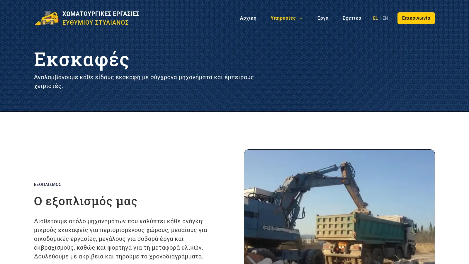
Screenshots
Outcome
Adding the real photography is now a routine step: each new photo goes through the prepared two-size processing and appears in the gallery under its category, already linked from the matching service page. The company gets a site that is fast on the phones most of its customers use, inherently secure, effectively free to run, and centered on its own completed works.